 |
| Figure 8. The Lyrical Watermelon. Reprinted from Graphic Design A Concise History (41), by R. Hollis, 1994, London: Thames & Hudson Ltd. |
My personal style involves a lot of flat colors, so this piece stood out to me when I was reading. I really appreciate the way the first page of solid black/gray compliments the second page with red/orange type with lots of white space. I believe that the black and white space on the page draws attention to the reddish, orange colors of the text. I also appreciate the way that the text wraps around the image at the bottom of the right page. The sans serif type also adds a simplistic feel to the page. The open space and the variety within the sizes of the type create an organized piece.
 |
| Figure 13. Book and Graphic Design Record. Reprinted from Graphic Design A Concise History (55), by R. Hollis, 1994, London: Thames & Hudson Ltd. |
Another aspect of my personal style that I saw when I was reading the book was the incorporation of flowers into a piece. Depending upon the boldness of the colors and the loudness on the page, I believe that some flowers can be seen as neutrals and actually add a sense of delicacy. I admire the way that the flowers are faded and also contrast the white yet draw in the color blocking that is done at the bottom of the page. The incorporation of the textbox within the gray space is a great way to not only break up the block of color, but also to draw attention to the text.
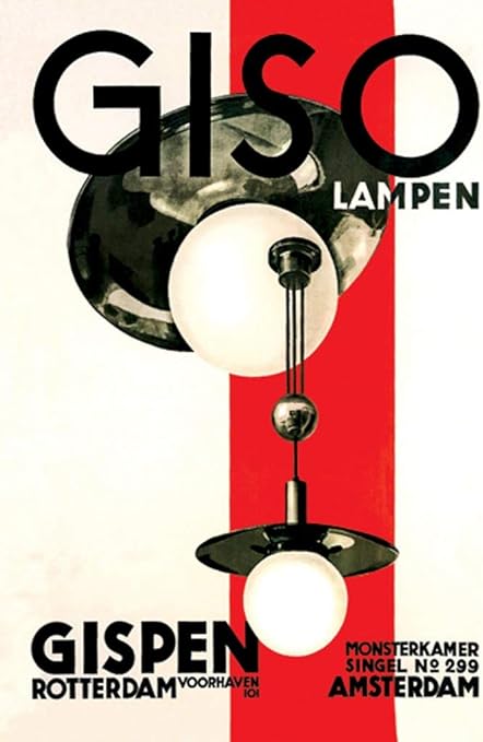 |
| Figure 1. Gismo Lamps. Reprinted from Graphic Design A Concise History (74), by R. Hollis, 1994, London: Thames & Hudson Ltd. |
I picked this last piece to discuss because I believe that it possesses features of both of the previous pictures. I like how the red color is used directly behind the image to draw the eye towards the lantern design. The red in this picture draws attention to another image, similarly to the way that the text in the first piece wraps around the image to create a frame effect. The red block also breaks up the off-white space that is in the background of the piece, much like the grey block in the second picture breaks up the white background.


Love your observations and also enjoyed how your third image touches on things mentioned in your first two examples. I also appreciate the simplicity and high contrast of the black and white paired with the large orange lettering. I think it has a nice flipped play between text and image. typically where text plays a secondary role under or around an image the image here feels secondary to the text.
ReplyDelete