Post 2 -- Harry Kowalczyk
After reading this section, I find that I do not like avant garde design very much. It is too crazy and busy. It is almost impossible to understand what and image is supposed to be of, or what the text is trying to say. None of it makes any sense, there are just random, massive letters thrown throughout the page. Granted, it is technically in Italian, but still, even if it was in English, where would you even start? It feels like it is just crazy for the sole purpose of being crazy.
 |
| Marinetti, F. T. (1919). "Futurist Words in Freedom". Retrieved from URL https://library.rit.edu/cary/les-mots-en-libert%C3%A9-futuristes-futurist-words-freedom (January 22, 2020). |
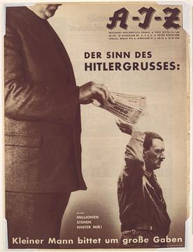
One piece of design showcased in the book that I was particularly amused by was the magazine cover making fun of Hitler’s salute, where the artist makes it to look like Hitler is reaching back to take money from a wealthy donor. The joke twisting Hitler’s millions of supporters into millions of dollars was very funny. I never would have thought such a piece could exist, given the way Nazis treated their enemies during their reign.
 |
| Heartfield, J. (1932). "The Meaning of the Hitler Greeting" [Magazine cover]. Retrieved from URL https://en.wikipedia.org/wiki/Nazi_salute (January 22, 2020). |
In general, I found the designs from Dutch designers to be the easiest to look at. Some of the product catalogs developed have very nice graphics and covers, especially the furniture catalogs. I found it interesting to catalogs for modern looking furniture from such a long time ago. It reminded me of the catalogs that IKEA puts out today. I also found the telephone manual to be interesting. I like how they use various mediums, but you can still read them and understand their message.
 |
| IKEA [Catalog]. (2015). Retrieved from URL https://en.wikipedia.org/wiki/IKEA_Catalogue (January 22, 2020). |

Comments
Post a Comment