Post 3 - Harry Kowalczyk
When reading the book, one of the pieces that grabbed my attention was the poster advertising Au Bucheron, the French furniture store. What really stands out to me personally was the angled lines in the background, that seem to emanate from the base of the tree, and fan out behind the tree and figure. This has an art deco feel to it, which I tend to gravitate towards. The reason I like art deco styling is because both of my parents are architects, so I was raised to pay attention to and admire these types of details.
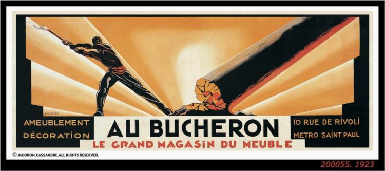 |
| Cassandre, A.M. (1923). "Au Bucheron" [Poster]. Retrieved from URL https://www.wikiart.org/en/cassandre/au-bucheron-1923 (January 29, 2020). |
One of the features of art deco design that I like a lot is the balance between simple, streamlined shapes and figures and the extreme amount of detail. In this poster for the 1933 Chicago World’s Fair, the big white towers are fairly plain and simple. The poster itself is made up of fairly simple shapes, mostly rectangles and circles. However, as you get down into the lobby/entry area, there are a lot of intricate details of various architectural fins and statues in the facade. The designer also put a lot of effort into capturing people, reflections in the water, and the overall environment. The poster has both straight and flowing lines, but they do not clash.
| Pursell, W. (1933). "Chicago World's Fair" [Poster]. Retrieved from URL https://en.wikipedia.org/wiki/Art_Deco#Graphic_arts (January 29, 2020). |
The book showed a few examples of Shell Oil posters, by Edward McKnight Kauffer, which were not exactly what I was expecting from a petroleum advertisement because they did not have any sort of automobile in them. One of them did have a robotic figure, which the author discussed how the figure represented a machine that needs lubrication. If this was the goal, then the author could have picked a better example. I found a poster of the same mechanical man where he was actually moving. This would have at least given a sense of motion, and therefore suggesting lubrication is needed.
.jpg) |
| Kauffer, E. M. (1936). "Austin Recommends Shell Oil" [Poster]. Retrieved from URL https://www.christies.com/lotfinder/Lot/edward-mcknight-kauffer-1890-1954-austin-recommends-5429986-details.aspx (January 29, 2020). |


I really agree with what you have to say about Art Deco, the idea of the angled lines emanating not only from the tree but the light behind it gives it a very unique and personalized feeling. I didn't even think to look that globally when looking at other influences of art deco and its very interesting to see that particular view of the Worlds Fair. The simple shapes and lines create such a dense and lively feeling in the environment and it's something I really appreciate in this style.
ReplyDeleteI was also drawn to the Au Bucheron poster, and it has even more effect when seen in color. Not only is the idea of showing the tree very unique for a furniture store, but the angles and lines really pull your eye first into the poster, then down to the name of the store. It very visually appealing the way the illustration lines up with angles of the rays, and the feeling of symmetry they give.
ReplyDelete