Tatum Abegg- Blog Post 3
This weeks reading was very inspiring in the fact that it gave me a lot of different methods I can use in my future work. It was cool to see the origins of a lot of different designs that we undoubtedly see everyday. Also, I have noticed that since beginning this book I have been able to notice a lot more of these styles being replicated in other peoples work. Another thing that this section discussed was the process of printing, and how important it is to design. People made a lot of original creations just by simply experimenting with different types of printing methods, for example, overlapping images and text, and allowing images to fade off the side of the page. I would like to possibly learn more about the process of printing in the future.
Again, this section reiterated the importance of geometry and design. Some of the most simple designs can become the most eye-catching, simply because of the meaningful placement of shapes, lines, and words. This can also be done with layout. The art of a good layout is not appreciated enough, and I think that with only words and a nice typeface, paired with a unique layout can create something powerful and beautiful. I think in my work I will try to reflect this idea of simplicity, rather than trying to add more to catch the eye of the viewer. This also correlates with the importance of the relationship between the designer and the client. It is crucial to communicate the message at hand clearly, powerfully and precisely.
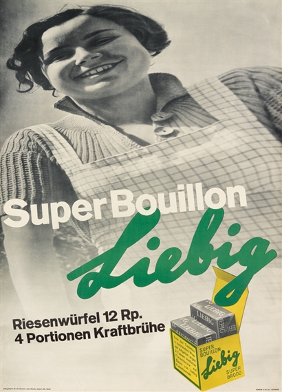
'Liebig Super Bouillon' poster 1934 [Anton Stankowski/ Hans Neuberg] from Hollis pg 80

Cooper, Austin 1931 'Posters for the Victoria and Albert Museum Exhibition' retrieved from https://www.retrotogo.com/2012/09/1930s-art-deco-posters-at-the-victoria-and-albert-museum-exhibition-poster-by-austin-cooper-at-habit.html
retrieved from https://inspirationfeed.com/layout-design-inspiration/
Again, this section reiterated the importance of geometry and design. Some of the most simple designs can become the most eye-catching, simply because of the meaningful placement of shapes, lines, and words. This can also be done with layout. The art of a good layout is not appreciated enough, and I think that with only words and a nice typeface, paired with a unique layout can create something powerful and beautiful. I think in my work I will try to reflect this idea of simplicity, rather than trying to add more to catch the eye of the viewer. This also correlates with the importance of the relationship between the designer and the client. It is crucial to communicate the message at hand clearly, powerfully and precisely.
'Liebig Super Bouillon' poster 1934 [Anton Stankowski/ Hans Neuberg] from Hollis pg 80
Cooper, Austin 1931 'Posters for the Victoria and Albert Museum Exhibition' retrieved from https://www.retrotogo.com/2012/09/1930s-art-deco-posters-at-the-victoria-and-albert-museum-exhibition-poster-by-austin-cooper-at-habit.html
retrieved from https://inspirationfeed.com/layout-design-inspiration/


Hey Tatum,
ReplyDeleteI must say that I completely agree with your sentiment in regrads to what these works embody. Simplicity is paramount in design for it is often the most simplest of designs that are remembered throughout history and the pieces you chose are no execption to that point. Learning the origins to these different design types is bound to be beneficial for you in the future.
Helloooo, yes I was thinking similarly about the way this chapter went about describing the relationship between the designer and the client. There was some quote about how no one asks the designer what they are thinking because the importance is the deliverance of what they are saying. I thought that summarized things in an interesting way, especially in thinking of how graphic design was built on this idea of "visual engineering". Behind the scenes cogs
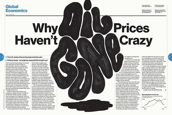
ReplyDeleteI really like the Global Economics publication layout you showed. I think this is an incredibly eye-catching design, which sucked me into the subject of the article. If I had seen this with normal type across the board I probably wouldn't stop to think about it, but design facilitates thought in ways that purposeless and boring text on a page cannot. I feel like this example also seems to play off of the same concept that was used in the Liebig ad, because they both have stable typography punched up by swirling and loose typography.
ReplyDeleteI was also really interested in the process of replication/printing. I think you raised an interesting point about how important it is to graphic design. Since learning about how the printing process has developed, I've also noticed how the pieces/posters we've seen have changed too. From hand-drawn everything to the printing press to experimenting with photography, everything has been so intrigued to learn about. I'd also like to learn about the printing process more. I think it really influenced design and I'd like to explore both topics some more too!
ReplyDelete