Blog Post 4
For the first photo that I chose I was drawn to the work of Pearce Marchbank. When I saw it in the book I was intrigued by the collaging of images. I think it is interesting the way that the designer chose to lay the text over the image on the right. It gives it an interesting effect as well as keeps the focus on the main image of Mick Jagger. I enjoy the simplicity of the color scheme as well in this design. Most of all I like the parallel of the poses of Mick Jagger and the women, it gives the page a very symmetrical feel to it. I looked at some of the other work done by Marchbank on his website for Oz and I think he is a really creative designer who plays with really fun imagery, text, colors, and shape to create very interesting and fun page layouts.

Marchbank, P. (1971). [magazine page] Retrieved from http://www.pearcemarchbank.com/Magazines/oz.html on February 10, 2020
For my second design, I chose to look at the designer Jamie Reed. I am a big fan of the Sex Pistols and I feel like the design work he has done for them does an amazing job at portraying the anarchist sound of the band in visuals. I chose to show one of his more recent works it was a poster for the band Pussy Riot, which is a feminist punk band very similar to the Sex Pistols. His style also has very collage elements. You can see this reflected in the cut out text spelling out the bands name. As well as in the layering of photos and colors.

Reed, J. (2012). [Poster] Retrieved from https://eyeondesign.aiga.org/seminal-punk-designer-jamie-reid-on-politics-pussy-riot-practical-magic/ on February 10, 2020
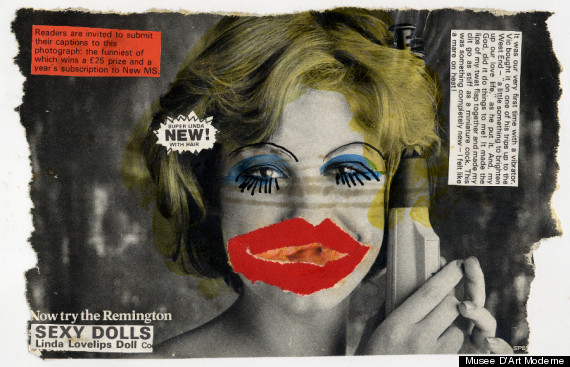
For my last work I decided to find another artist that went a long with the punk collage look of Jamie Reed. I discovered the work of Linder Sterling, photography, radical feminist photomontage, and confrontational performance art. Upon further research she has done work designing magazine covers as well. Her work is similar to Jamie Reeds but she definitely puts her own creative spin on things with the drawing aspect of her design. She uses what looks like magazine and text clippings collaged together and then adds aspects of her own drawing to her work.
Huffington Post, (2017). Linder Sterling’s Feminist Punk Collages Tear Up 30 Years Of Bad Advertising, Retrieved from https://www.huffpost.com/entry/linder-sterling-feminist-punk-collage-photography-musee-dart-moderne_n_2317757 on February 10, 2020


Even though they are very different all of them seem to have a certain feeling to them as it's very unique in color placement and certain placement of typography. the concept of collages are different from artist to artist and it seems that the examples you found are taking from other articles and placing them together for a motivational and movement piece. I especially like the last one as it shows the sterotypical woman with blonde hair, red lips, blue eyeshadow and eyelashes with the sex dolls on the bottom
ReplyDelete