Blog Post 4
 |
| Figure 1. Frazier Automobile Advertisement. Reprinted from Graphic Design A Concise History (113), by R. Hollis, 1994, London: Thames & Hudson Ltd. |
This piece by Paul Rudd clearly illustrates the beauty
behind contrasting images with handwriting or typography. I am personally drawn
to images that have words on them, that’s why this advertisement stood out to
me. The collage that is created by the marker-type stroke by the asymmetry of
the typography and the line leading the eye to the car at the bottom – truly draws
attention to the product in which they are advertising.
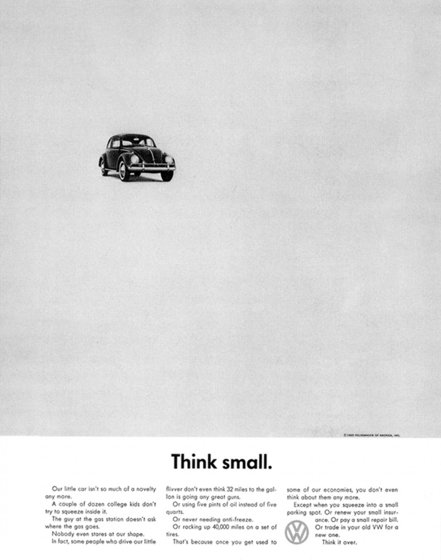 |
| Figure 2. Volkswagen 'Think Small" Advertisement. Reprinted from Graphic Design A Concise History (113), by R. Hollis, 1994, London: Thames & Hudson Ltd. |
Another advertisement that I also really appreciated was the
“Think Small” Volkswagen print. The simplicity of the peace not only allows for
the product to shine, but it also draws attention to the message at hand. This
image is one of the most famous designs from the advertising campaign for the
VW beetle. It was ranked as the best advertising campaign in the twentieth century
by Ad Age. The history of this advertisement is astonishing. It seemingly
shifted the direction of graphic design in advertisement in its time. The simplicity
of the piece draws the viewers eye directly to the car that they are selling.
Simplicity began to pop up across a plethora of advertisements after the
success of this design for the VW campaign.
 |
“Displate - Metal Posters: Make Your Home Awesome.” Metal Posters – Displate.com, displate.com/dijemamc/minimalist-vogue-poster.
|
This Vogue cover shows how simplicity progressed
throughout time after the VW advertisement was released. This cover was released
shortly after and features a lot of white space with minimal designs and
coloring. Although color is still present, it does not overpower the piece, but
rather draws attention to the minimal designs that fill the white space. As we discussed
in class, vintage magazine covers do not have text written all over the front.
I really appreciate the flow that these older covers have, rather than present
day covers where the text draws attention away from the art and design of the
cover.


I am a big fan of simple advertisements, and I can tell from your examples that you are too. There is something about simplicity that drives the advertisement. For example, in the Vogue poster, the limited features of the face stand out against the stark background. It easily communicates what the magazine is about: elegance, beauty, etc. For both the Frazier and Volkswagen ads, the simplicity of the single graphic element, surrounded by nothing or by type, is was draws me in. I know what both of those ads are for without having to read anything on them. Simplicity is one of my favorite elements of design. It can really enhance almost anything
ReplyDelete