Post 4 - Harry K.
In this section, which talks a lot about American graphic design before and after World War II, I find one of the most interesting pieces to be some of the automobile advertisements. I think this is fitting, not only because of my interest in classic cars from the time period covered, but also because nothing is more American than the automobile. The advertisement for Frazer Automobiles is very interesting to me because the flowing arrow gives the impression that the car has been driving around, adding a sense of movement to the picture. Also, the line has the feel that it was stamped, due to the blotchy spots where the line fades out. The car itself is a nice pop of color in red at the bottom of the ad.
 |
| Rand, P. (1946). "Frazer" [advertisement]. Retrieved from URL https://images.lib.ncsu.edu/luna/servlet/view/all/when/Modern?widgetFormat=javascript&os=1350&widgetType=thumbnail&showAll=when&embedded=true&pgs=100 (January 4, 2020). |
There are a lot of very cool, in my opinion, vintage car advertisements from the 1940s and 50s. Take this Cadillac ad from 1941. The front face of the red car pops out of the deep blue background, grabbing your attention. The big, white Cadillac crown logo tries to sell the reader on Cadillac the company, while the cream colored band at the bottom focuses on describing the new cars for the year. The headline and price of $1345 stand out, and emphasis on “now” and “Cadillac” by means of larger text makes the price seem like a great deal.
 |
| "Now - a Cadillac for $1345" [advertisement] (1941). Retrieved from URL http://www.oldcaradvertising.com/Cadillac%20&%20LaSalle/1941/1941%20Cadillac%20Ad-01.html (January 4, 2020). |
As I have seen a lot in this book, graphic design has a huge role propaganda and war. A poster that has always caught my attention is this of a man driving alone in his car. Because of the of gas for the war effort, carpooling was seen as important for the war effort. Not doing so, as the poster suggests, helps the enemy, as shown by the ghostly outline of Hitler.
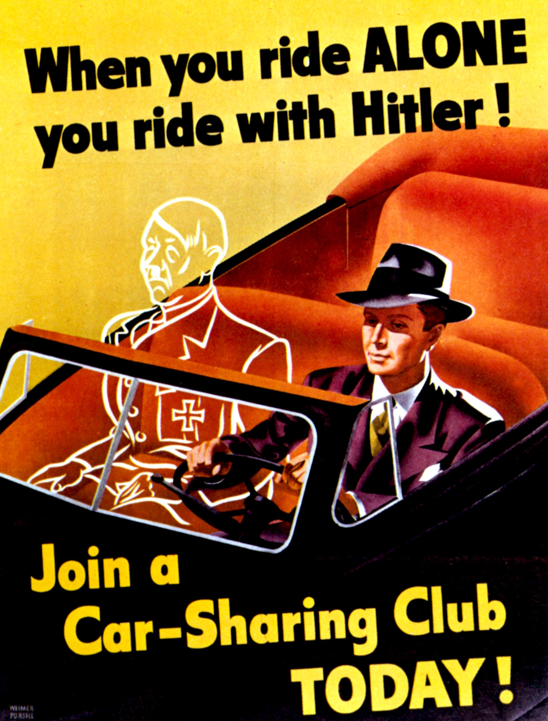 |
| Pursell, W. (1943). "When you ride alone, you ride with Hitler!" [poster] Retrieved from URL http://www.artnet.com/artists/weimer-pursell/when-you-ride-alone-you-ride-with-hitler-s6xGV0IVucneomSCvyF2wQ2 (January 4, 2020). |


I think it's interesting how everything during this time was somehow linked with the war effort. Imagine seeing the last example and then going fora drive with a friend: you could think of yourself as some sort of war hero for carpooling. Not much to do with the design but very interesting to think about lol
ReplyDeleteI agree with you that most of this book has a lot of content about war and propaganda. This era of graphic design helped influenced future designs with form. I liked the poster with carpooling with Hitler because it feels like a advertisement for the his car adn the Beetle that he wanted to produce to compete with Ford at the time of the war.
ReplyDeleteIn the first design you chose I love the combo of the photographic imagery, type, and the almost drawn element. I think each element helps to build the design and guide the eye throughout. The draw element really give the whole thing movement! I do agree with you that the red pops of color draw your eye one I think being the product (the car) and the second being the name of the company.
ReplyDeleteIt is interesting to me how in a time filled with war and distress, they managed to fit a lot of subtle and also not so subtle advertisements for automobiles and similar things like saying if you don't ride share with someone you're essentially riding along with Hitler which looking back is such a crazy message but in that time it really seemed to be effective at getting that message across to people.
ReplyDelete